Surprise! A new-look VALORANT Buy Menu was introduced with patch 8.11, and there was no announcement of it at all.
One of the most impactful updates in recent VALORANT memory was patch 8.11. It involved the console beta details, a map pool restructuring, and huge tweaks to Duelist Agents. Well, another noted change that Riot did not included in the patch notes is the VALORANT Buy Menu.
It looks brand-new now, with the community a bit torn over how they feel. Let’s take a look at the updated Buy Menu and reactions.
VALORANT new and old Buy Menu comparison
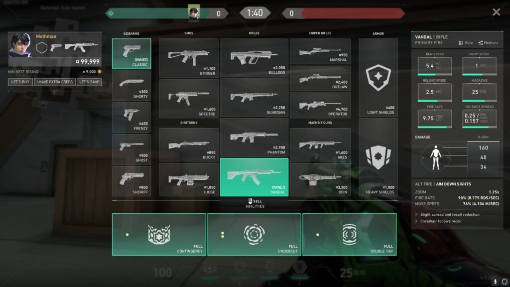
Overall, the new VALORANT Buy Menu UI is a lot “fancier” than the old one. The gradient within the purchased items is more pronounced, your shield appears drained if you only have a certain amount left, and really, everything just pops more.
It also has a fun a little animation when you open it. It is a quick zoom onto screen, but if you pay close enough attention, you’ll notice it. And it has a completely overhauled weapon statistic section on the right side.
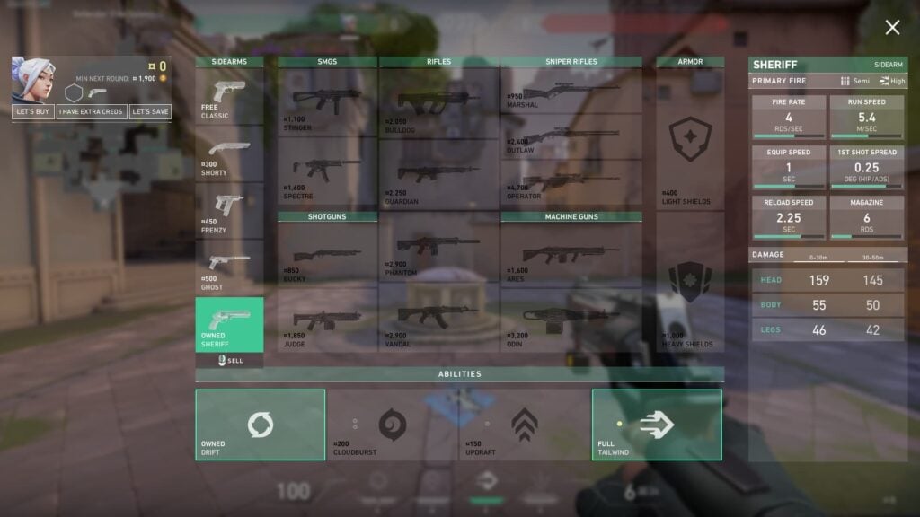
Compared it to the previous VALORANT Buy Menu and it is a sizeable change. It feels much more alive, and less static, than the old one. There is a lot on the screen at once, however, with the new stats, and the change of Ability name and price to the right side of the box.
It was bound to happen eventually, with the inclusion of the Outlaw taking up some decent space that saw names and prices overlap with the weapon outlines. It’s just very interesting that Riot Games made the change without any sort of announcement.
Reactions to the new Buy Menu
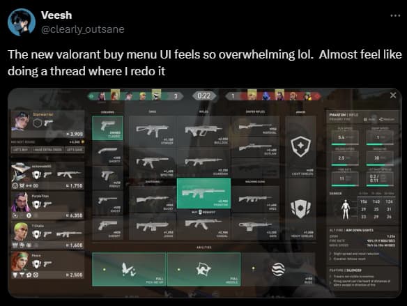
Needless to say, the new VALORANT Buy Menu has garnered a reaction to those who have noticed it. Players have taken to X and Reddit to share their thoughts. Here are some not-so-keen reactions to the update:


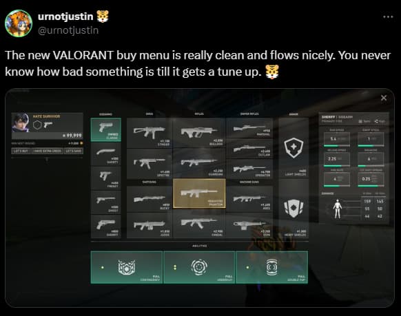
And here are the more positive responses:



Whatever side of the fence you fall on doesn’t really matter, as the new UI is probably here to stay. We will all have to get used to the new VALORANT Buy Menu sooner or later.
Stay tuned to esports.gg for more esports news and VALORANT coverage.

