"Alliance is [A] home for passionate people."
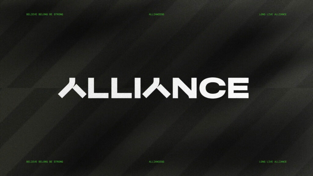
Esports organization Alliance has revealed its rebrand and logo. Read on for the details behind this Alliance esports logo rebrand.

Alliance logo rebrand
After working with brand agency Kurppa Hosk, Alliance announced its rebrand and logo. According to the organization, this rebrand represents the bridge between the East and West. Alliance is known for its involvement in Dota 2, StarCraft 2, League of Legends, Hearthstone, VALORANT, Apex Legends, and more over the years and has accumulated fans worldwide.
“As Alliance has expanded from its roots in Sweden to a global organization with teams across the world, the time has come to usher in a new era,” the announcement stated, adding that the new logo symbolizes a new era.
“After divesting from Twitch in 2016 and returning to Sweden as a player-owned organization, we embraced the color Green, developed a distinctive shield and embarked on a journey to reclaim our position in the esports world,” the organization added.

Alliance esports logo explained
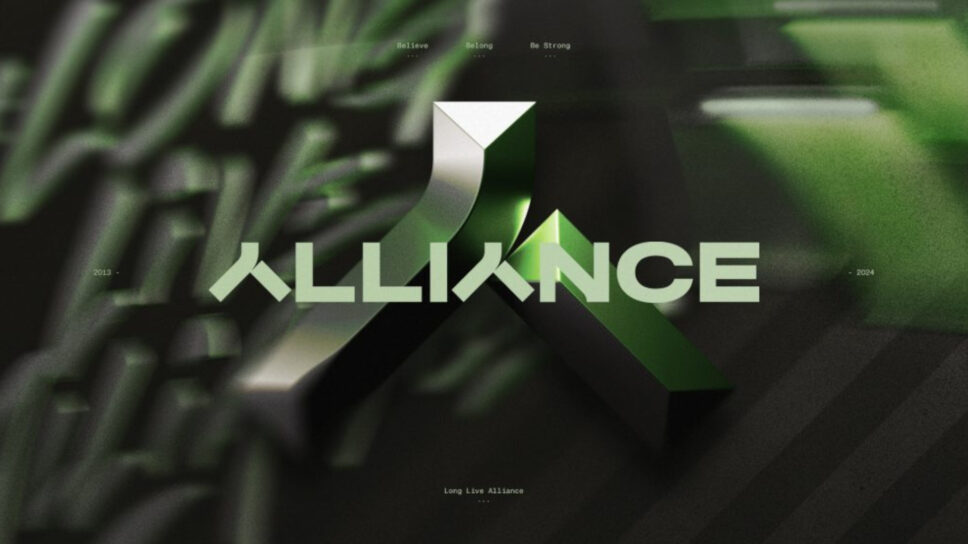
The new Alliance logo looks like the “人” character in Chinese. This character means people or person. According to a source from Alliance, the symbol signifies people, fire, a roof, or a bridge. It’s also “signifying our long-time, multicultural organization.” Therefore, “Alliance is [A] home for passionate people.”

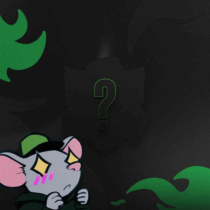
Alliance esports mascot Rattio
Meanwhile, the organization has Rattio as its mascot. Rattio is a rat that represents the social aspect of the organization, according to the announcement. “Embracing the identity of “rats” – initially perceived as a curse – it has today become one of the most defining aspects of our org,” Alliance continued.
The esports organization added that Rattio stands as its mascot while embodying resilience, perseverance, and determination.
Alliance’s new branding will roll out everyone over the next few weeks.
That’s all for now. Stick around on esports.gg for more news and updates.

