With the Summer Client Update, Dota 2 received changes to its map rendering that have enhanced the look and feel of the game.
One of the last changes detailed in the Dota 2 Summer Client Update, released on August 31, was a series of alterations to map rendering. These graphical have helped make Dota 2 look and feel more vibrant, and we’re here to break down those changes.
Dota 2 Updated Map Rendering
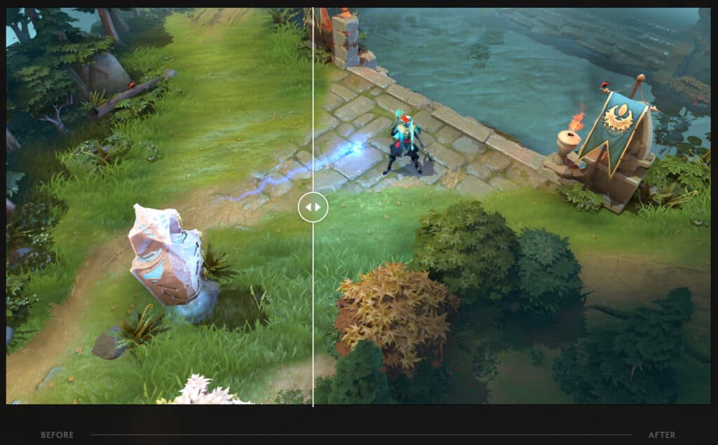
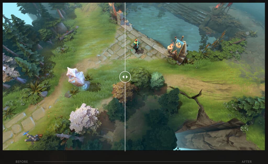
According to the main post on the Dota 2 website, Valve has done a "bunch" of work to make the game world look better, and went into detail explaining how, with a number of before and after shots.

Clearer Particle Lighting
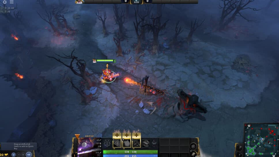
Particles now show more clearly on terrain and heroes, and are brighter. There's individual light sources for particle effects and tower shots, so the projectiles seem to affect the world around them more intensely.
This looks great as well because of the next change, enhanced shadows!
Enhanced Shadows
Shadows are now larger, more dynamic, and are higher resolution. In addition, clouds now cast shadows again (they did in previous versions, but were missing from the new map initially), and sun shadows are also more visible.
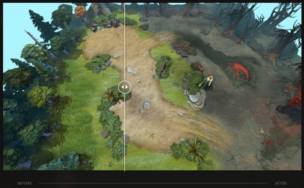
Greater Contrast and Tone Mapping
Contrast has been increased in darker map regions which overall gives more readability and visibility, and a more stylized look for the map.
Bringing it all together
Overall, these changes have enhanced the look and feel of Dota 2. In playing, we've also not noticed any slowdown or much more load on graphics cards or PCs as a whole, so all the changes appear to be very highly optimized and efficient. What we especially like are the how the particle affects seems to interact with the new shadows. Tower hits feel extra impactful (as if health disappearing wasn't enough), and there's a couple of spell that really look fantastic now.
